
 I’m coming to this a bit late (after a week in Derbyshire followed by a busy week of work) so I’m probably only going to be repeating what everyone else has said, but never mind.
Yep, it’s crap, isn’t it?
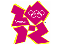
I’m usually sceptical when the Great British Public is said to be united for or against something. The media have a habit of craftily spinning the uninformed rantings of a large minority into the “view of the common people”. In this case, though, the response really does seem to be of almost unanimous derision and ridicule. I mean, what kind of graphic designer really thought that the style of 1986 kids’ TV idents was due for a revival? Even at the time, they never used that sort of style for Olympic logos!
Now, I’m no expert on graphic design, but it’s pretty clear to me that a number of qualities should be present in a good logo… it should be instantly and unambiguously recognisable, it should be easy to reproduce in a variety of media and it should contain something reminiscent of the product or concept it represents. This jagged mess certainly doesn’t say “London” to me. Fair enough, it does say “2012″ if you squint enough, while simultaneously trying not to think of what Lisa Simpson is doing, but it doesn’t even represent the Olympics properly… they’ve had to colour all the rings white to fit the design. Gah!
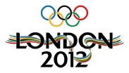 On the other hand, here’s the logo they used for the Olympic bid. It’s fairly conservative, but it does the job… the text tells you exactly what it represents, the Olympic rings are shown in their traditional colours, and those colours are repeated in the five-strand ribbon which outlines the shape of the river Thames. With some tweaking, that could be a perfectly good logo for the actual Games, and a worthy addition to a long line of classic emblems.
But of course, that wouldn’t happen, would it? We’re dealing with corporate brands here, and the bid was a different product altogether. As Chris Townsend, commercial director of the 2012 Olympics, said to the Guardian, “It is designed as a proper consumer brand rather than a corporate brand you’ve seen in other games and it will stand alongside all the other leading sports brands.” Riiiiight.
 Ah well, that’s my rant over. I’m just sorry that we’re going to miss out on the best logo of all. Briefly shown as one of the alternative designs submitted by readers of the BBC website, it was then removed. In a just world, Sean Stayte’s design would be the official logo for the 2012 Olympics (more info here and there’s now a t-shirt! Everybody buy one!)
The last one seems to follow the infamous goatse trend…
How hard is it to design a logo for the Olympics that says “London”?
Pretty bloody easy, I should think.
You could do something with the tube map and the colours of the olympic rings for a start.
Yeah, it really shouldn’t be difficult… London has plenty of instantly recognisable symbols available. They’ve decided that the world of Olympic logo design is very conservative and therefore needs shaking up, but they’ve missed the point. The Olympic Games, repeating as it does every four years with roughly the same set of events and aims, is inherently conservative.